
20 Secrets From Strategy Consulting & Persuasion Science To Create Memorable Presentations
How do you build a memorable and persuasive presentation?
I spent over ten years working in the consulting industry at places like McKinsey and Boston Consulting Group and now as a freelance consultant. Communication is central to everything the consulting industry does and in some ways explains why the industry has been so successful for so long.
Yet, across the business world and increasingly in the entrepreneurial community, few understand how to present information in a compelling way.
Most default to the behaviors of their colleagues or the templates that their company provides. While these methods may result in a beautiful slide, the content tends to fall short.
I am motivated to help people tell remarkable stories, communicate complex information in simple ways, and to teach people how to be memorable. Over the past several years, both through my work and through my research, I have identified many “secrets” of what it takes to create compelling and impactful presentations.
I’ve broken these tips into three sections:
Make Your Message Memorable
#1 Ignore The Facts
Carmen Simon, who wrote Impossible To Ignore, one of the best books on creating memorable content
“It is difficult for our audiences to remember many facts, unless we repeat them regularly and repetition is often hard in business contexts”
For analytical thinkers, it can often be an overwhelming impulse to want to “show your work.” Part of this may be wanting to prove how much effort you put into something and another part may just be a misunderstanding of how to craft a compelling story.
Does this mean not to use any facts? No, but if you are going to share them, figure out what the most important ones you want your audience to remember and then make sure they are communicated in the most simple way possible.
For example, instead of saying “only 34% of people are engaged with their jobs” you could say “out of a group of 100 people, only 34 say they are engaged with their jobs” or “slightly more than 3 out of every 10 people are engaged with their jobs.”
#2 If you want to use facts, put them in context
Carmen Simon also points out a second drawback to facts in her book ‘Impossible to Ignore’:
“… when we present facts, abstract ideas, and meanings – essentially conclusions – it is difficult to control those conclusions. People are more inclined to act if they believe they reached a conclusion. And it’s harder to reach a conclusion when they don’t see what you saw.”
To deal with this challenge, she recommends helping the audience see what you saw. The best way to do this is to be very explicit and descriptive about the sensory details of the experience - what you saw, heard, felt and tasted.
Compare the following two stories, one with sensory details and one without:
Story 1: She drank a glass of red wine.
Story 2: After a long day of travel, she settled into her waterfront villa in Fiji. She slowly poured herself a glass of red wine and sat down in a hand-crafted chair, where she spend the next 30 minutes watching the sun slowly set. Right before it set, It ignited the sky in a red and orange glow. As she put the glass of wine to her nose and sniffed the smell of a perfect red wine, she thought about how lucky she was.
Both stories are factual accounts of the events, but one is more memorable and offers an experience and sensory anchors in which the data is embedded into, allowing your audience to connect with and remember the facts.
I don’t think I need to tell you which is which.
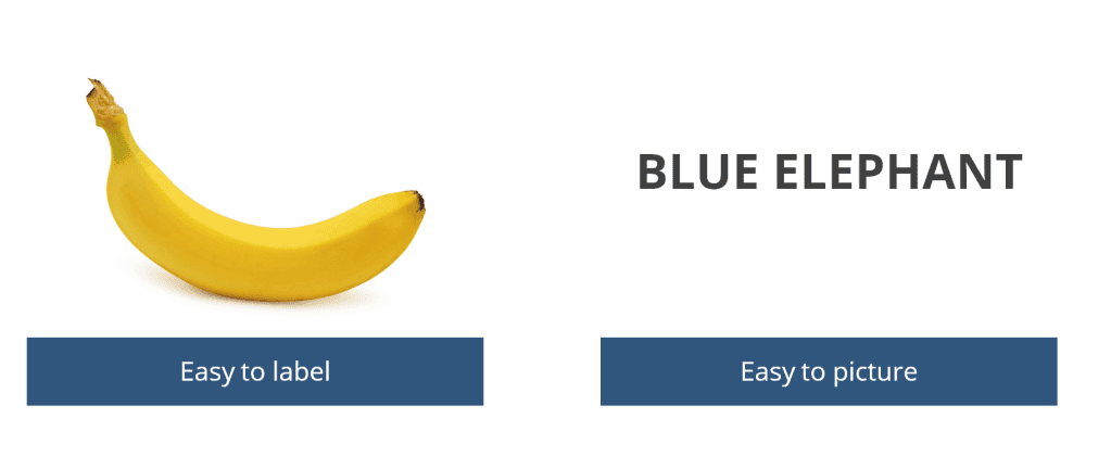
#3 Pictures Are Only worth 1.5 words
The line “pictures are worth 1,000 words” seems to be repeated so often that it must be fact, right? Turns out pictures are only worth about 1.5 words, or at least that is the finding of Professors Paul W. Foos and Paula Goolkasian.
What they actually found is that some pictures are more powerful than others - pictures that are easy to label. However, text or language that is easy to picture can also easy to remember. It’s quite easy to picture a purple elephant, just like its easy to label the yellow fruit in the below image.
#4 Pair the abstract with the concrete to make it more memorable.
So we know that pictures are not worth 1,000 words, but everyone says you should use pictures over lots of text, right? The problem is that pictures are often complex and an audience of 100 people may ascribe 100 different meanings to the picture. Take a look at the following picture:

What do you see? Some people might see “people on their phone” others might see “loneliness” or “addiction.” Without giving the audience guidance on what you are trying to show with the picture, they are going to draw their own meaning:

The opposite is also true. The business world uses many abstract words like efficiency, value, impact, improvement, productivity, innovation and success. If you are giving a presentation, try to be very specific about what you mean when you say something like impact - does it mean everyone on the team is doing great work or the boss is getting paid?

#5 Tell people why it matters
If you can help the audience understand the deeper meaning of what you are trying to portray it can help them connect with your message. Think about raising money to help an imaginary person, Angela, with her cancer treatment:
- Concrete Facts: Our goal is to raise \$1000 to pay for Angela’s treatment
- Abstract Explanation: Our goal is to raise enough money so Angela does not have to worry about her future
- Meaning: Our fundraiser will help save Angela’s life
Each of these can be appropriate for different audiences, but if you are trying to communicate something that really matters to you, tell them why it matters!
#6 Repeat what you want remembered
In consulting there was a popular line that went something like this: “tell them what you’re going to tell them, tell them and then tell them what you told them.”
As well as being a catchy phrase, it is useful advice. Too often in presentations, people are more focused on detailing every single detail of research they uncovered rather than thinking about what they want the audience to remember.
Figure out what your one key theme is and then integrate it into every piece of your presentation.
#7 Use Powerful Words To Invoke Emotion

Words can be a powerful tool to trigger our imagination. Words or phrases like “imagine,” “think about a time,” “remember a time when you were really happy” can be effective ways to engage with your audience. Allowing your audience to access their creativity or memory can allow for memorable experiences. The persuasion researcher Robert Cialdini once did an experiment looking at how people might react to three questions:
- “Excuse me, I have 5 pages. May I use the xerox machine?”
- “Excuse me, I have 5 pages. May I use the xerox machine, because I have to make copies?”
- “Excuse me, I have 5 pages. May I use the xerox machine, because I’m in a rush?”
It turns out including the word “because” - no matter the reason after that word, increased the rate of compliance with the request to over 93%. Of course, you shouldn’t just add certain words to your presentation, but when used to fit well with your story, they can be very effective. Copywriter Greg Ciotti makes this same point:
“you must understand why these words are persuasive, and you must use them in the contexts that make sense for your audience and your business. If you just start slapping them on every piece of content you create for no apparent reason, you’ll quickly see just how unpersuasive they can be.”
In his work, he found five words were consistently effective in his work:
- You
- Free
- Because
- Instantly
- New
…but don’t just follow advice of someone you read on the internet, go experiment for yourself. Watching the reaction of your audience is always the best way to assess what works.
#8 Make Any Powerful Points Distinct From The Rest
Is there a point that you want to make that is more important than the rest? If so, one thing you can do is to make the formatting distinct from the rest of the presentation.
Another thing you can do is change your delivery style for that point. Can you use a handout? Can you deliver your message from a different part of the room? Can you tell a story without using slides. Think about what is most important and make sure you deliver that in a distinct way
#9 Give people something surprising (but still familiar)
Look at the image below of the blue orange. You know it is a blue orange, but you have likely never seen anything like it before (unless you hang around the same stock image places as me!). What makes the image memorable and invoke an emotional reaction is the fact that it is both familiar and novel. You are able to understand what it is while still acknowledging that it is surprising and different.

This can be useful when trying to convey a new idea to an audience. Have them connect the new metaphor or image with your key takeaways or message.
#10 Tell Stories
Seth Godin has embraced the power of story and persuasion in everything he does. He reflects on why this is so important:
“Communication is the transfer of emotion….You can wreck a communication process with lousy logic or unsupported facts, but you can’t complete it without emotion. Logic is not enough.”
The Psychologist Uri Hasson has shown that when you tell a good story, it “couples” the brains of the storyteller and the receiver, meaning the same regions in both brains of the people will be activated. So what does a powerful story look like? Professor Paul Zak found that the most effective stories activated a cortisol and oxytocin response in the body. This results when a story both gets people to pay attention (cortisol response) and to care about what is happening (oxytocin). Combined, these elements can get people to take action.
#11 Activate An Emotional Response
In his famous text, Rhetoric, Aristotle argues that three elements make up a persuasive argument. Logos is the appeal to logic. Ethos is driven by the speaker’s credibility or character and pathos is an appeal to emotion. More specifically he defines pathos as ““awakening emotion in the audience so as to induce them to make the judgment desired.”
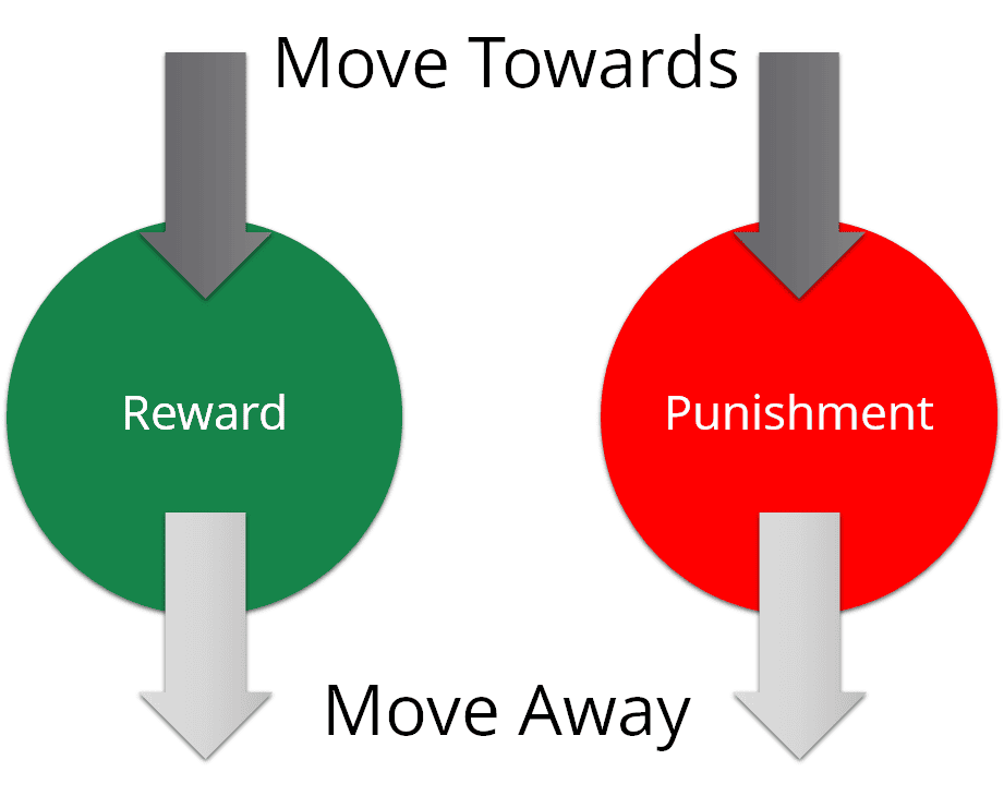
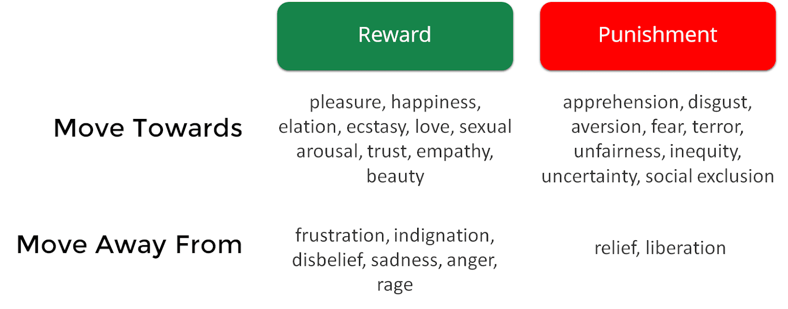
In thinking about emotion in presentations, there are four different ways to think about framing your message: moving towards or away from rewards or towards or away from punishment. Each of these can be more or less effective depending on the audience.
Almost anywhere you look, especially anyone selling products on the internet, you can see these techniques at work. Take, for example the below Uber ad recruiting drivers:
 Uber Ad: Move Toward Rewards
This is a clear “move towards rewards” call to action. In this case, they have likely found that people are more likely to sign up as drivers when it is framed as a positive benefit for themselves. Toyota takes a different approach with its “offer ends June 3rd” clearly listed below the sale.
 Move Away From Rewards Example
While this is not framed as a clear “punishment,” the implication is clear. Don’t miss out on this sale. Depending on the audience, you can try to elicit an emotion that is appropriate for your audience. Carmen Simon offers a map of the different emotions you might trigger using these different approaches in Impossible To Ignore:
Here are four different examples I created for my course as an example of the four different techniques.
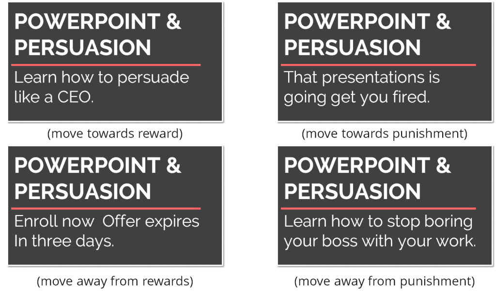
As you can probably tell, some approaches work better on you than others.
Structure Your Message
#12 Pick Three Things or “Points” You want to get across
I once spent several hours trying to figure out if there was any research behind why things appear so often in groups of threes. Unfortunately, the best explanation I found was that three is the least number of items needed to form a pattern. Perhaps the best argument for embracing the “rule of three” is the observation that it emerges in creating many of the most memorable ideas or stories across many domains.
- Stories: Three Little Pigs
- History: “Life, Liberty & the Pursuit of Happiness”
- Physics: Newton’s Three Laws
- Writing: Three-Act Structure
- Slogans: Snap! Crackle! Pop!
- Photography: Rule of Thirds
- Consultants: Three Key Things
When giving a presentation, using three themes is a great way to structure your talk and a good organizing principle of complex ideas. Tim Ferriss uses this approach to structure his talks:
“approximately 2-minute introduction, three 10-minute segments, and a 2-minute close. I use this “rule of thirds” for the three segments whether the presentation is 60 minutes or 10 minutes.”
#13 Structure your story using the pyramid principle
The Pyramid Principle was created by Barbara Minto at McKinsey & Company. It is a framework that is effective for organizing a complex argument to communicate clearly and persuasively and is still used in almost every presentation at McKinsey & Company today.
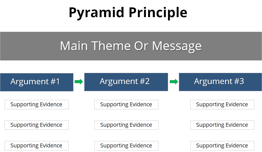
The Pyramid Principle helps you to focus on your message and organize it in a simple way. The way it is taught first at McKinsey is as a writing technique. We were taught to “start with the answer” and then to outline the supporting arguments, with a structure like this:
- Paragraph 1: Overall recommendation summarizing the overall message and three arguments
- Paragraph 2: Argument #1 including evidence, research, interviews and other relevant analysis
- Paragraph 3: Argument #2 including evidence, research, interviews and other relevant analysis
- Paragraph 4: Argument #3 including evidence, research, interviews and other relevant analysis
There are many ways to organize the arguments that depend on the type of audience you are trying to persuade and the strength of your supporting research.
If you want to see an example of how I map this to a real presentation I created, check out the following video:
#14 Be Generous early in the presentation
In the first five minutes of the presentation, if you can offer some sort of tip, tool or free offer, you can build a sense of trust and connection with your audience. Don’t wait until the end to give something away to the audience, engage them early. This can help tap into the reciprocity principle of persuasion highlighted by Robert Cialdini:
“Simply put, people are obliged to give back to others the form of a behavior, gift, or service that they have received first.”
#15 Think About The Action You Want Them To Take
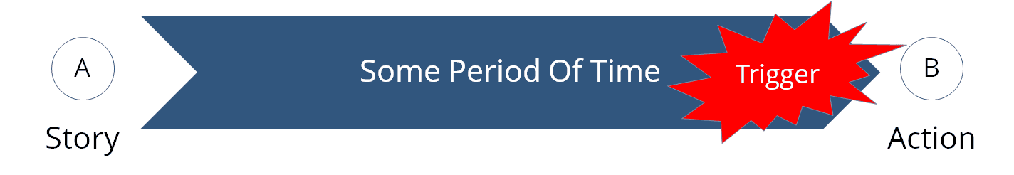
Most presentations have some sort of action that you want the audience to take. It is not enough to just hope your audience takes an action. You should think about priming them with a trigger so that they can think about taking action at the appropriate time. Here are a few examples:


Designing Slides
#16 Make slides like a strategy consultant:
There are many simple little “hacks” you can use to create good-looking powerpoint slides that look like the ones you might see from McKinsey or BCG. I created a short 20-minute video that will walk you through some of these hacks
You can also find templates around the web that have been tried and tested to save you time. I made my own which you can download here.
#17 Use Of Colors
While many people have strong opinions about the colors of their powerpoint slides, there still isn’t great research on the best combination of colors. Some people swear by black backgrounds and white font, while others stick to white background with the occasional picture slide.
Professor Zufic at the University of Zagreb performed a study on people’s memories in e-learning scenarios based on the color of the content they were exposed to. In their findings they found fifteen combinations that were more effective for memory than black text on a white background.
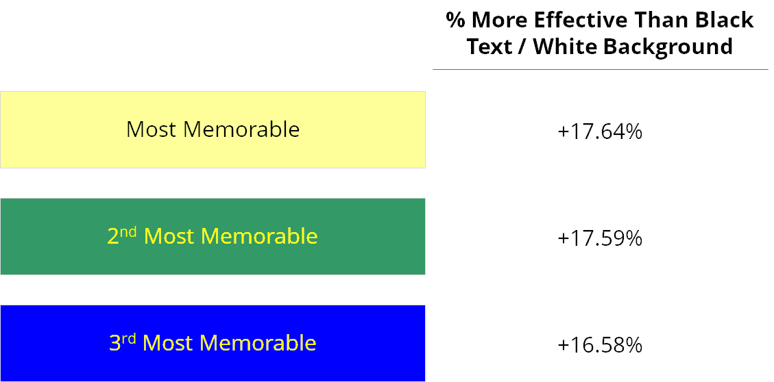
While the study did not test the full range of colors and applications, you may want to experiment with different color combinations beyond the default choices. I recommend checking out this color optimizer to ensure your color schemes look great,
#18 Vertical Flow
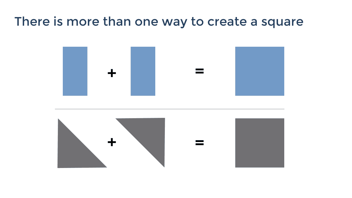
When you first start at McKinsey, one of the first things you are taught is that a slides title should always be the takeaway of the slide. Other firms are more flexible with this rule and might put takeaways in other places of the slide, but once you see how often people violate this in presentations (and how hard it is to figure out what the underlying message of an individual slide is) you will not want to be an offender.

Don’t label a slide “Overview: Diabetes.” Give them a piece of information like “Diabetes is the fastest growing disease in Western nations.” Then prove it in the content of the slide.
The less text and data you need to “prove” your point, the more persuasive and memorable the content will be. Here is an example I like to use to show this without using any text:
#19 Horizontal Flow
If you are giving a long presentation, you should think about the overall presentation as a comprehensive story. You should be able to scan through the entire presentation in a couple minutes and have a good sense for the overall structure of that story. If you have incorporated the idea of “vertical flow” into your presentations, the titles should be the key points or takeaways for each slide. The next step is to see how they fit together.
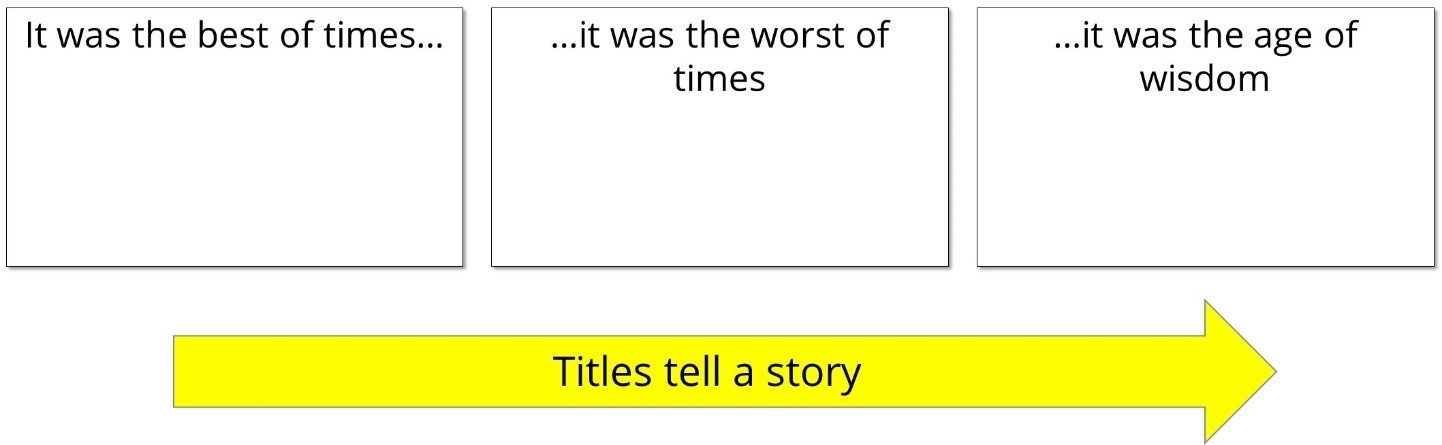
A quick check I do while compiling a presentation is to use the outline view in PowerPoint and check to see if the titles make any sense when read in order.
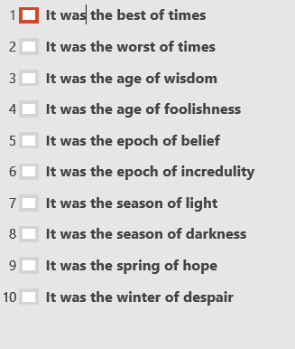
While they don’t need to be a Dickens-level masterpiece, there should be some level of logic to the overall flow of the presentation.
#20 Concise and informative bullets/writing
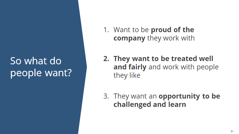
We made it to number 20 and somehow never talked about bullets. Is there a place for bullets? Sure, but I hope after reading this you realize that bullets are only the surface of a great story. I tend to gravitate towards the rule of three and unless the document is intended to be read in detail as a research report, I try to keep it as simple as possible. Here is an example of a simple slide where I was trying to impart some wisdom on company culture:
So there you have it! Everything you need to create compelling, memorable, and persuasive presentations. I hope you take away at least one or two things to make your presentations a little more engaging and memorable to your audience.
Go Deeper!
For \$49, immediately download the 100+ templates I created based on my experience in consulting so you can start creating kick-ass presentations now. I also do one-on-one coaching with executives to help them develop presentations for CEO-level communication.