Action titles: how to write slide titles that carry the argument
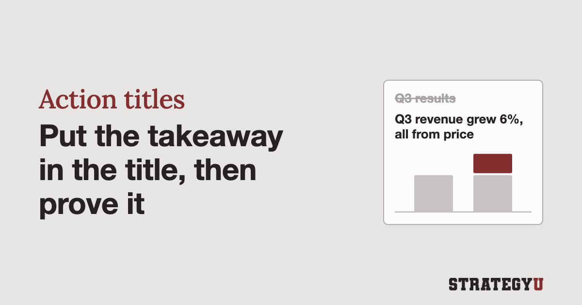
A slide’s title should be its takeaway, written as a full sentence, and the rest of the slide should prove it. Consultants call this an action title, a “lead,” or, as I prefer, the “so what?”
The alternative, or what most people do, is putting a label, like “Q3 results” or “Market overview.” This is a waste of the most important real estate on a slide, where people actually look first.
I wrote this article to convince you to stop doing that once and for all.
Former consultants tend to be militant about this rule once they learn it, and I think for good reason. A good title is evidence of good work and good thinking that has gone into what you are showing people. People dislike PowerPoint not because of the software itself, but because of the lazy thinking that passes for slides, and a generic label is usually good evidence that you are stuck in front of a boring presentation.
Minto and McKinsey both want a sentence, not a caption
The idea of having an action title on every slide was drilled into me at McKinsey.
Barbara Minto puts the rule in four words in The Pyramid Principle: “Use statements not captions.” Her example is the difference between “Sales outlook” and “Sales outlook is favorable.” As she explains, “The latter form leaves no room for the audience to make a wrong assumption about the essence of the point you are making.”
At McKinsey the title is called the “lead.” Ethan Rasiel, in The McKinsey Way, sets the standard: “A good lead expresses the point of the chart in one simple sentence.” I prefer “so what?” because it’s easier to remember, and it gives you a simple question to ask of every slide: “So what is this telling me?”
The action title, lead, or “so what?” is part of what I call the rule of vertical flow. Everything below the title exists to prove it, and a chart, bullet, or callout that doesn’t support the claim at the top comes off the slide or moves to a different one.
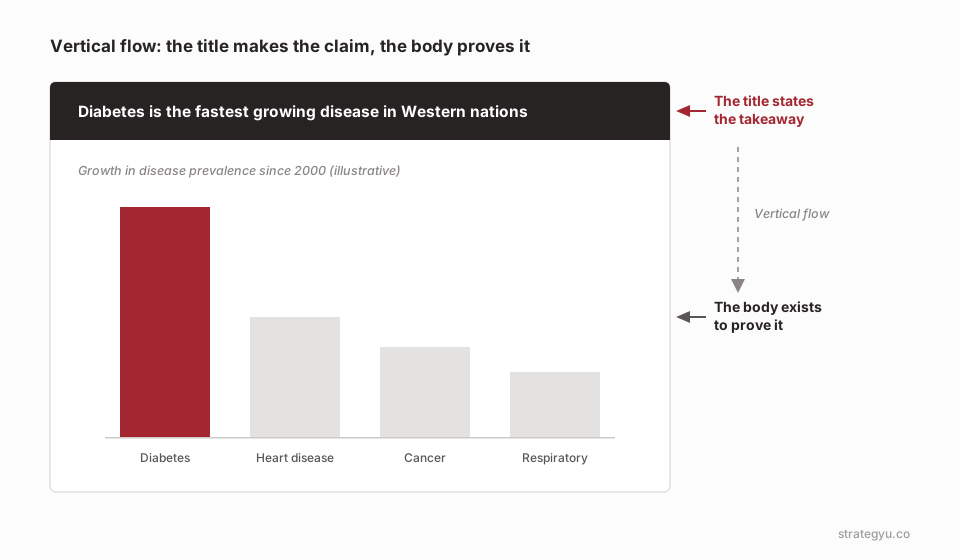
“Overview: Diabetes” tells the reader the topic. “Diabetes is the fastest growing disease in Western nations” tells them what to think. The same rewrite works on any label:1
| Label | Action title |
|---|---|
| Customer survey results | Two-thirds of customers who left cited slow delivery, not price |
| Competitive landscape | Three regional rivals have taken 8 points of share since 2023 |
| Cost overview | Labor, not materials, explains most of the cost gap with our peers |
| Next steps | Approve the two-market pilot by March to launch before summer |
| Q3 results | Q3 revenue grew 6%, but all of it came from price increases |
A title can be a full sentence and still be a label
The trap is a sentence that only announces a count. Minto calls these “intellectually blank assertions” and warns that they “cover up incomplete thinking.” Her example is someone who summarized a section as “The company has two organization problems.” Pushed to say what the problems had in common, he found the real point, “The major organizational problem you face is your inability to delegate authority,” and discovered he had four problems to list, not two.
The slide version is “Three key findings from the interviews.” It tells the reader how many points are coming and nothing else. Write the finding itself, or, if there are three, a title that says what they add up to.
Read the titles alone and they should tell the story
I call this horizontal flow. A good trick I still use is PowerPoint’s outline view, or pasting every title into a document and reading it like a memo. A busy executive who read only that page should get your recommendation and the reasons for it.
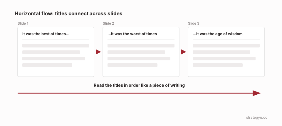
When the titles don’t read as a story, check the structure of the deck before you reword individual titles. The fix may be to go back to the pyramid. It’s easier still to get the order right before any slides exist, which is what a ghost deck is for.
Each slide gets one message
Rasiel describes McKinsey’s charts as following “the cardinal rule of one message per chart.” A chart may hold several insights, but “the job of the chartist is to pick which point to make.” His fix for a chart with more than one point is to “copy it with a new lead and the relevant information highlighted.”
This is a big mistake I see lots of people make with PowerPoint. They try to put too much into one slide, when it could easily be split into three slides. A title with “and” joining two separate claims is the warning sign. “Margins fell and the sales team turned over” is two slides.
You can deal with this by ending a title with an ellipsis…
…and then continuing the message on the next slide. “Margins fell in Q3…” sits over the margin chart, and “…and the sales team turned over at the same time” sits over the attrition numbers. The reader still follows one thought, and each slide only has to prove its half.
A title is ready when it makes a claim the slide proves
Before a deck goes out, check that each title is something a reader could disagree with, since a title nobody could dispute is probably still a label. Then cover the title and look at the chart alone. If a reader wouldn’t reach the same conclusion from the chart, either the title overreaches or the chart is the wrong one.
Last, show the slide to someone for ten seconds, the ten-second test, and ask them the “so what?” If they can’t say, rewrite the title. Formatting won’t rescue a title that doesn’t make a claim, which is the problem behind pretty slide syndrome.
Open the last deck you sent, find the three weakest titles, and rewrite each one as a claim. Then check whether the slides underneath still prove what the new titles say.
Footnotes
These pairs are made up for illustration. ↩