Before and after: improving a PowerPoint slide, step by step
I’m going to walk you through how I think about improving a slide. You can take the same approach with your own slides.
First, let’s take a look at this slide and try to make sense of what it means. The company and every number on it are made up, but the numbers add up.
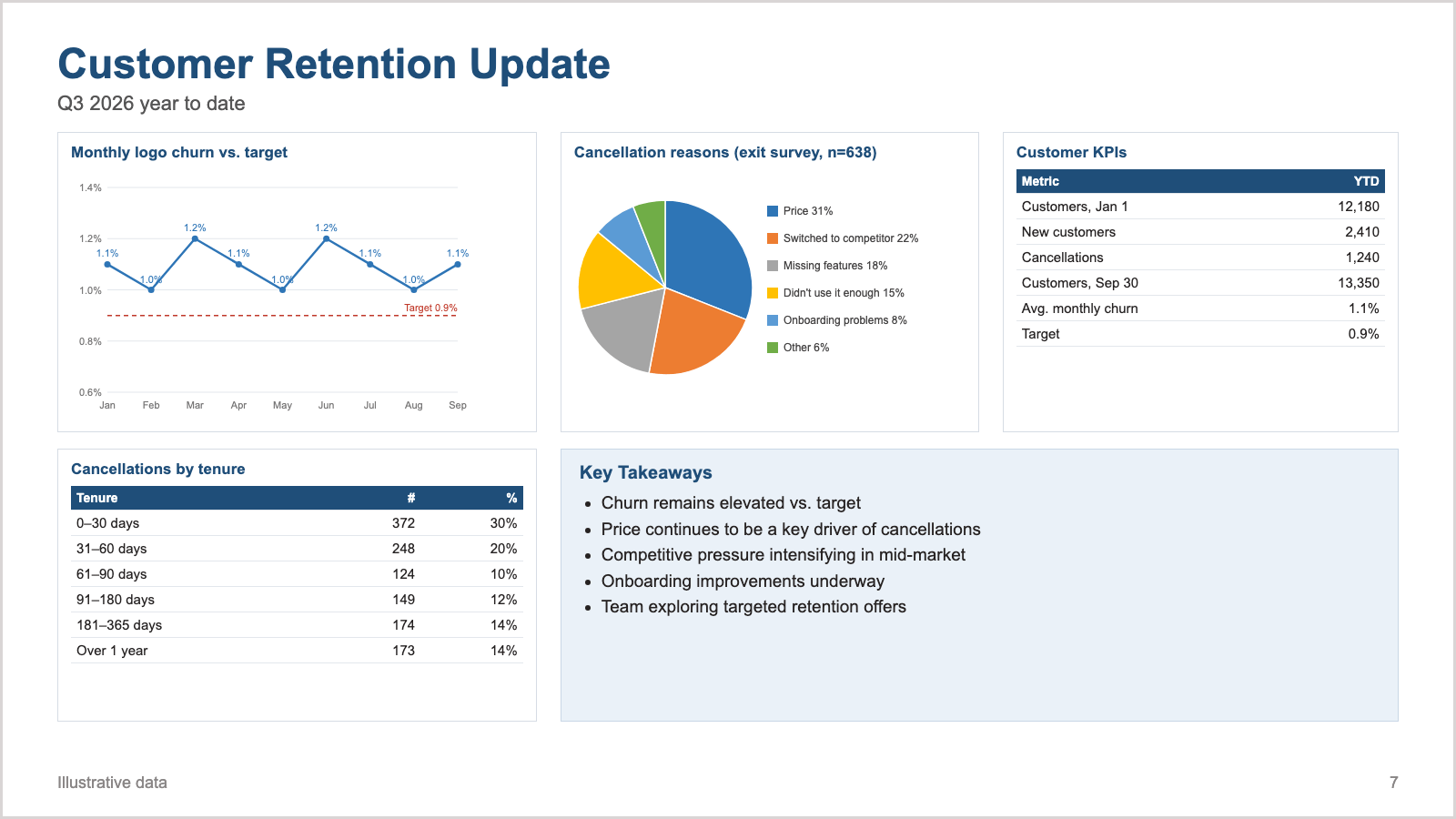
Start with the ten-second test
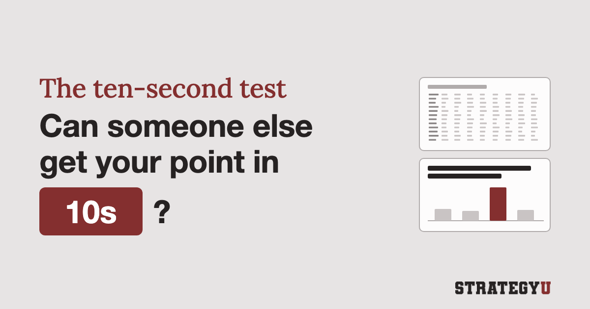
Give the slide the ten-second test: look at it for ten seconds, then try to say what it wants you to think.
You might come away with “churn is above target” or “price is the problem.” The slide supports both and doesn’t say which one matters.
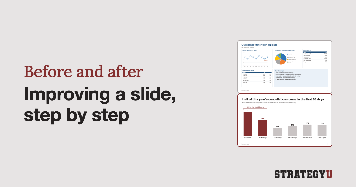
The title, “Customer Retention Update,” names a topic, so the reader has to work out the point from four exhibits and a takeaways box.
Ask “so what?” of each piece
Go through the slide one exhibit at a time and write down the single sentence each one supports.
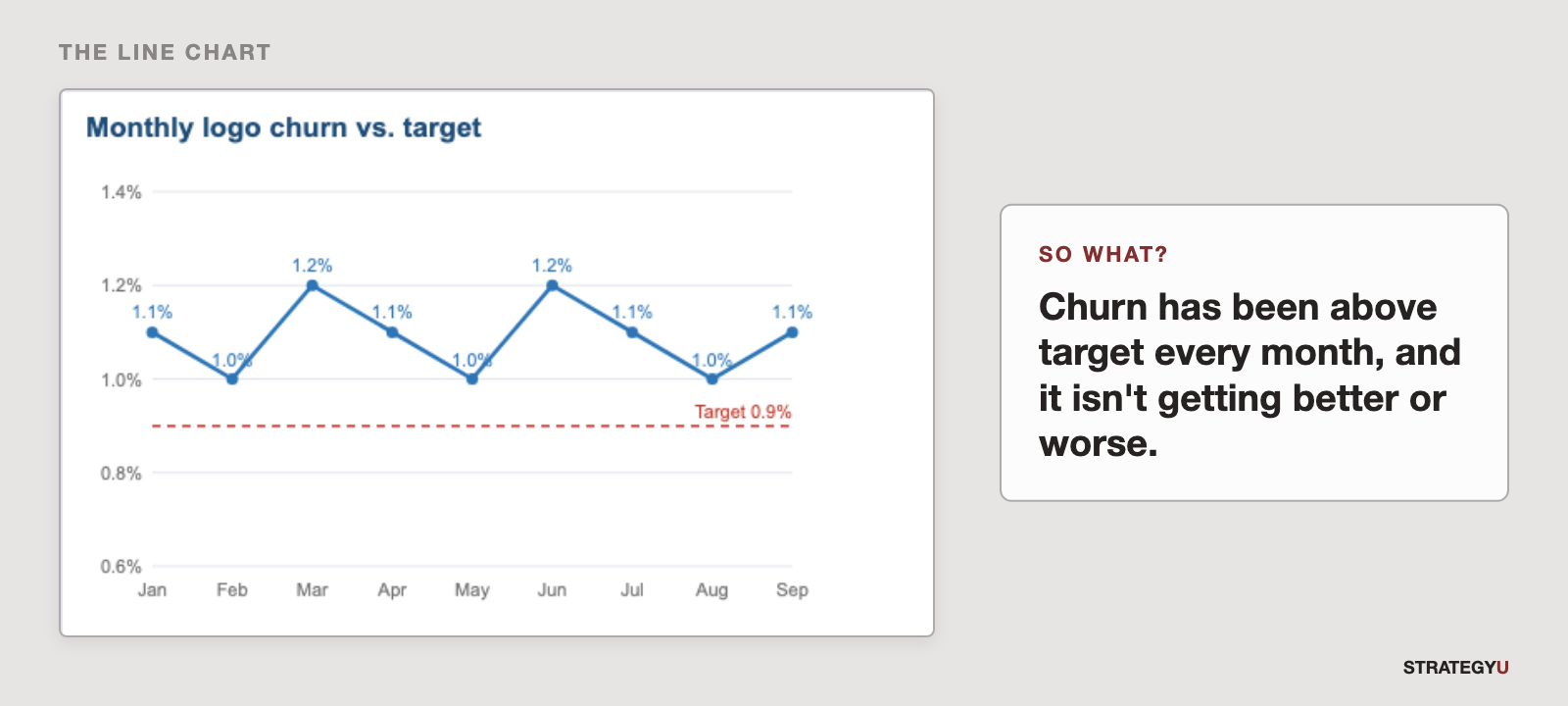
The line chart. Monthly churn sat between 1.0% and 1.2% all year, against a 0.9% target. So what: churn has been above target every month, and it isn’t getting better or worse.
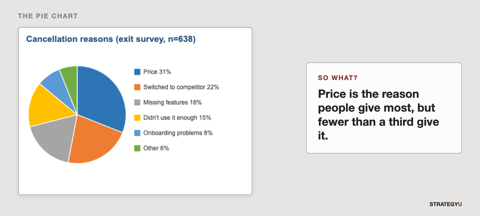
The pie chart. Price is the most cited reason, at 31%, followed by switching to a competitor at 22%. So what: price is the reason people give most, but fewer than a third give it. The survey also has 638 responses for 1,240 cancellations, so it covers about half the people who left. And you have to match six colors to a legend to read the chart, which is the problem with pie charts.
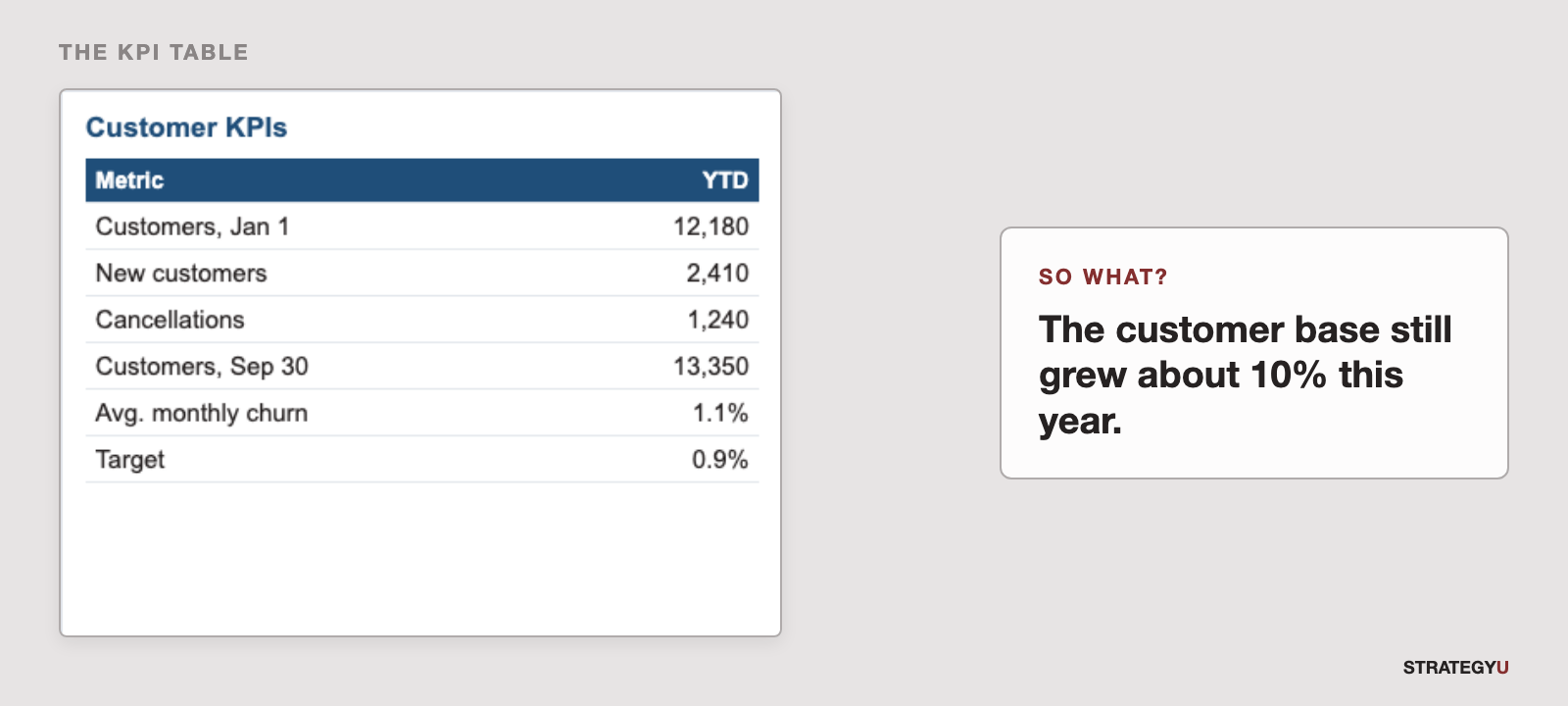
The KPI table. The company started the year with 12,180 customers, added 2,410, lost 1,240, and ended September with 13,350. So what: the customer base still grew about 10% this year.
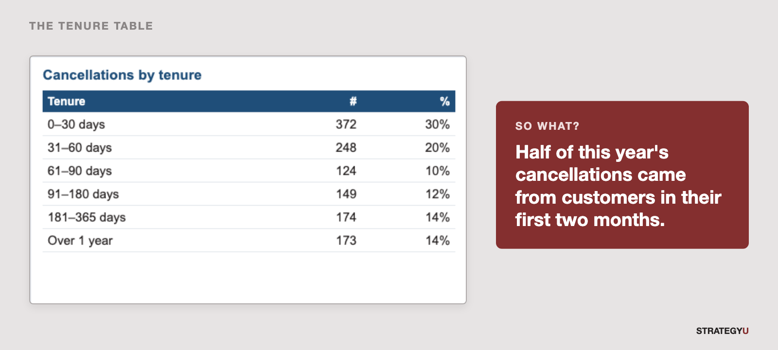
The tenure table. 372 cancellations came in the first 30 days and 248 more in days 31 to 60. That’s 620 of 1,240. So what: half of this year’s cancellations came from customers in their first two months.
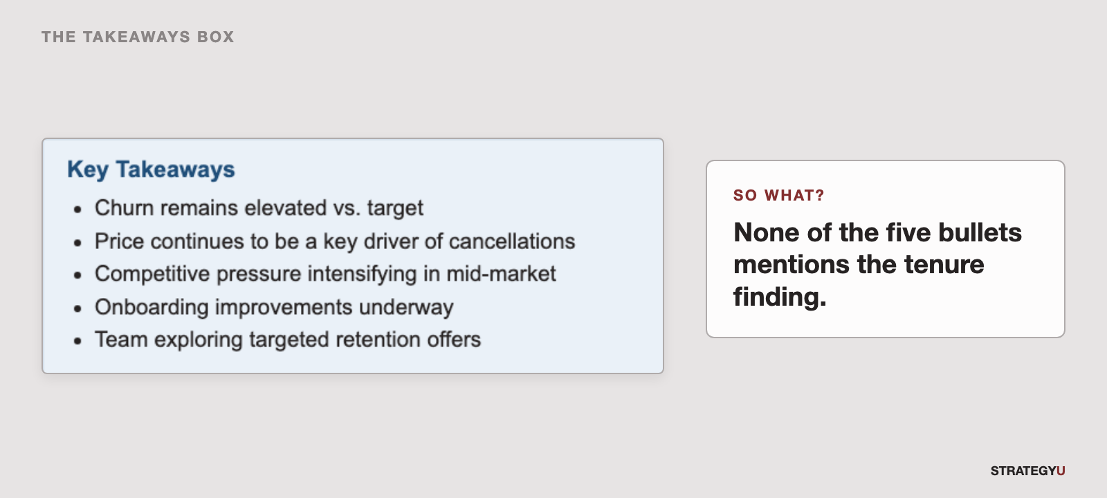
The “Key Takeaways” box. Five bullets: “Churn remains elevated vs. target,” “Price continues to be a key driver of cancellations,” “Competitive pressure intensifying in mid-market,” “Onboarding improvements underway,” and “Team exploring targeted retention offers.” So what: none of the five bullets mentions the tenure finding. Two of them, “Churn remains elevated vs. target” and “Price continues to be a key driver,” could go in any quarter’s update. That’s fluffy language: it reads as a summary to the person who wrote it and gives the reader nothing to act on.
Pick one message and make it the title
Of those sentences, the tenure one is the finding. It’s based on all 1,240 cancellations, not a survey of half of them, and it’s the one finding the takeaways box leaves out. It also points somewhere specific: a customer’s first two months.
So that becomes the title, written as a full sentence:
Half of this year’s cancellations came in the first 60 days
This is an action title: someone who reads only the title still gets the point.
Choose the chart that proves the title
The title is about when people cancel, so the chart should show cancellations by tenure. Tenure has a natural order, so the bands run left to right as columns.
The first two columns are a different color from the rest, and a bracket over them gives the total, 620, so nobody has to add 372 and 248 in their head.
Move everything else off the slide
The other findings are still true, but they don’t support this title, so they move:
- The churn-versus-target line becomes its own slide with its own title, something like “Churn has held at about 1.1% a month all year, above our 0.9% target.”
- The exit survey becomes a bar chart in the appendix, with a note that it covers about half of cancellations.
- The KPI table goes to the appendix.
- The takeaways box goes. If onboarding work is underway, it belongs on a later slide that says what’s changing and when.
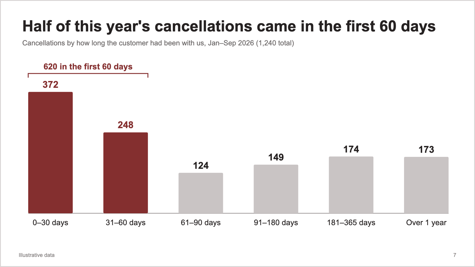
Every bar on the new slide comes from the tenure table in the bottom-left corner of the old one.
On your next update, write down the one sentence each exhibit supports, then use the strongest one as your title.