
The epidemic of pretty slide syndrome
Most people who find success in the business world figure out how things are supposed to look. There is a “good enough” way to format an email, a status update, and a PowerPoint slide, and you can learn it by copying the formats people around you use.
The problem is that most people stop there. They fill out the template instead of doing the deeper work of figuring out what the information means for the person receiving it. In regard to PowerPoint presentations, I call this pretty slide syndrome. The slide looks finished, so nobody asks whether it says anything.
I’ve seen it coaching business leaders on pitch decks, board presentations, and CEO strategy updates. It is just as common at that level as it is in a first-year analyst’s weekly update.
What it looks like
Here are two versions of the same information:
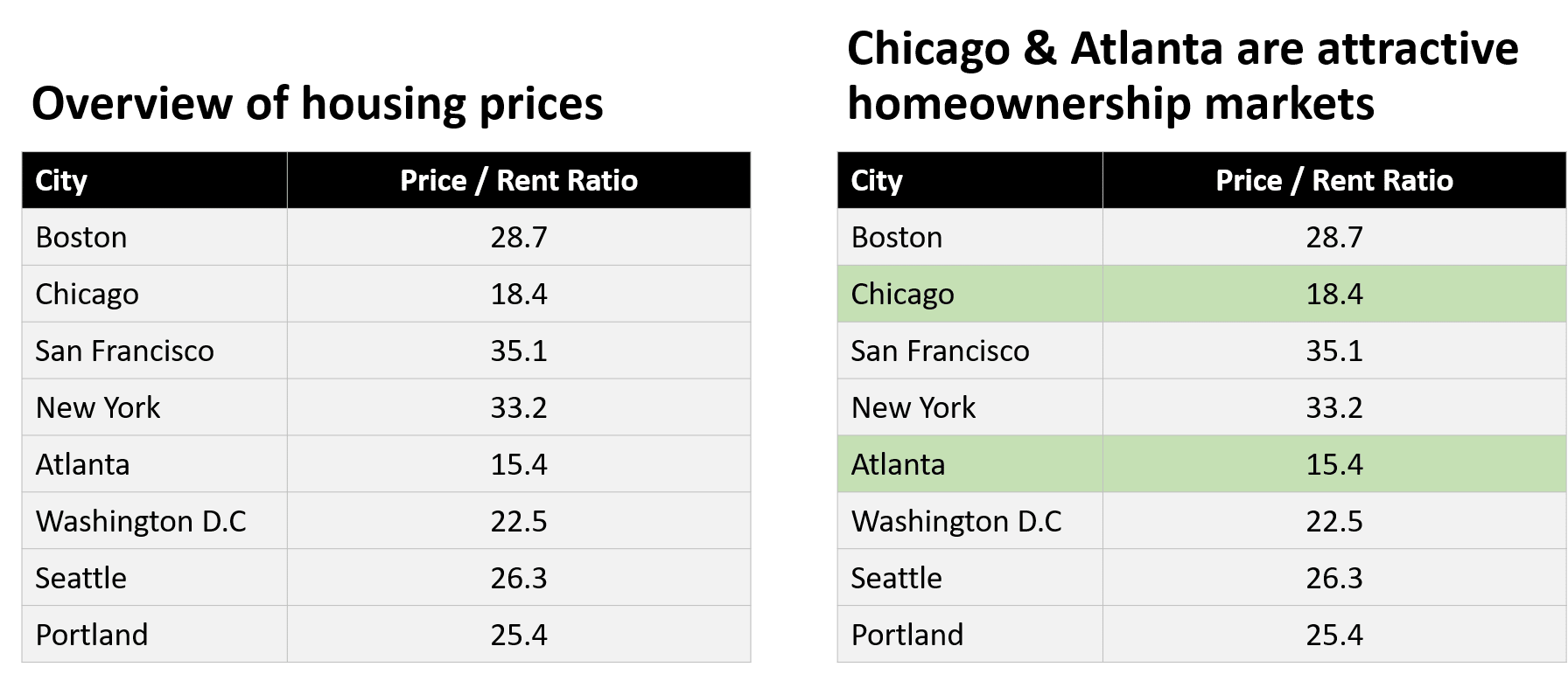
The table on the left is fine. It is neatly formatted and gives useful information. The table on the right tells the audience what to think. The title is the takeaway, the relevant rows are highlighted, and a reader who knows nothing about real estate walks away understanding that lower price-to-rent ratios probably favor buying.
Both tables contain the same data. The difference is that someone decided what the numbers mean and put that decision on the slide. That decision is the actual work, and it is the part that pretty slide syndrome skips.
The left slide would sail through most reviews. It passes every check people usually apply: a clean table, consistent formatting, and a sensible header. Whether it gets to the “so what?” is a harder question, and almost nobody asks it.
The same failure shows up on full slides. Here is a churn update built with a common template pattern I’ve seen people use, with a stat row, a clean chart, and a column of icons that level up the pretty factor another 15%:
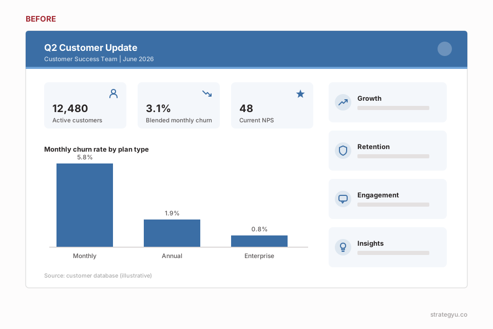
Every element is formatted well but none of it tells the audience what it should think or what’s important. Here is the slide after the thinking is done:
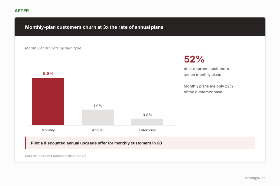
The title makes the claim (passing the vertical flow test), and the body of the slide “proves” the claim. The basic number on the right builds on a clear story from top to body to the right. Now consider the two slides and notice what it’s like looking at both. The information is the same but the second slide is the result of clearer thinking and synthesis.
Why pretty slides get you surprisingly far
Formatting is visible and learnable. Synthesis is invisible and hard. When you are under deadline, it is much easier to demonstrate the first than the second, so polished-but-empty slides become the default output of entire organizations.
And in fairness, the pretty slide syndrome persists because it works. Most audiences can’t tell the difference between a slide that looks right and a slide that is right. A clean deck signals competence, and in many meetings that signal is never tested. It holds right up until someone senior asks what they are supposed to do with the information, and the answer isn’t on the slide because it was never in the thinking.
AI makes it worse
AI slide tools produce polished output by default. The slides come out nicer than the average slide in a big organization, and they arrive in minutes. For someone judging their own deck by how it looks, this feels like the problem is solved.
But the model doesn’t know what your audience needs to decide, and it will happily generate a beautiful deck without that knowledge. The synthesis doesn’t disappear. It gets pushed to whoever sits through the presentation and has to figure out what you were trying to say. I wrote more about this in my post on using AI in knowledge work: AI output comes out polished without the rigor behind it, which makes pretty slide syndrome more common, not less.
A test for your own decks
The way out is to create some space between consuming the information and producing the output. Before building a slide, I push coaching clients to ask three questions:
- Why am I showing this information?
- Does this matter to the audience?
- Am I just trying to show how smart I am?
That last one stings, but it explains a lot of decks.
After the deck is built, read only the titles. At McKinsey this is drilled into new consultants: the title of a slide should be its takeaway, and the titles read in order should tell the story of the whole presentation. If your titles are labels like “Overview of housing prices,” the thinking isn’t done yet. If they are claims like “Chicago and Atlanta are attractive homeownership markets,” a reader could skip everything else on the page and still walk away with your argument.
Next time you finish a deck, don’t ask whether it looks done. Read the titles in order and see if they form an argument. Wherever they don’t, go back and decide what that slide is trying to say before you touch the formatting again.