The Pyramid Principle: Book Summary & Review (Part 4: Logic in Presentation)
This review is the fourth and last in a series on Barbara Minto’s 2010 edition of The Pyramid Principle:
- Logic In Writing
- Logic In Thinking
- Logic In Problem Solving
- Logic In Presentation (you are here)
The first three parts are about getting the thinking right. This one assumes you already have. Minto’s premise for Part Four is that a correct pyramid can still fail on contact with a reader, because of how it gets laid out on a page or a screen.
Her argument for why is about perception, not design:
The reader’s or viewer’s eye always sees the logic before his mind comprehends it. Thus you want to use what the eye sees to reinforce what the mind receives.
Format, on that account, is not something applied to finished thinking. It is the first thing a reader processes, ahead of any word, and it is already telling them what the structure of your argument is before they have read enough to know whether it’s true.
Headings Mark Levels Of Abstraction, Not Places To Rest The Eye
Chapter 10 covers prose on a page, and Minto sets a demanding target. She wants the reader to have your entire thinking, by which she means the introduction, the main point, and the key line points, “in the first 30 seconds of reading.”
Her mechanism is hierarchical headings. Position on the page does the work: the further right a heading sits, the more subordinate the idea, and anything at the same level of the argument gets the same visual treatment every time. She gives six rules for using them.
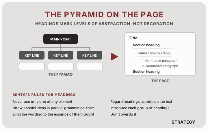
Two of the six do more work than the other four.
The first rule is that you “can never have only one of any element.” One major section, one subsection, one dash point: all wrong. Her reason is that a heading advertises a level of the pyramid, so a level with one item on it is a contradiction. She is blunt about the alternative, which is that “you shouldn’t just stick in a heading because you think it would look good on a page, the way newspapers and magazines do, to break up the printing.” If you have a single subsection, either you are missing its sibling or the heading shouldn’t be there.
The second is that headings sit outside the text. She calls them “for the eye more than they are for the mind,” which means the reader skims them and does not absorb them as sentences. So you cannot write a heading and then continue the sentence in the paragraph below it. The test she gives is deletion: “your entire document should be able to be read as a smooth-flowing piece without the headings.” Take them out and see whether the prose survives. If a paragraph now starts mid-thought, the heading was carrying a piece of the argument that the reader was never going to read carefully enough to catch.
Getting this right buys you something else. Properly formulated headings become the table of contents, and the table of contents becomes a precis of the whole report. That only works if you put real ideas in the boxes rather than labels. It is the same discipline as the Part 2 rule about intellectually blank assertions, applied to the contents page.
Her section on transitions runs several pages and covers telling a story, referencing backward, and summarizing before you move on. The sentence that carries all of it is this one: “you do not want to relate what two chapters or sections do, you want to relate what they say.” The version she rejects is the standard one, some variation of “This chapter has looked at the need for priorities. The next chapter looks at how these priorities should be set.” It names two topics without carrying anything across the seam between them, so the reader arrives at the next section knowing only that a new section has started.
Slides Change The Job From Explaining To Holding Attention
Chapter 11 starts by naming the assumption behind most decks, which is that a visual presentation is “simply a report in slide form.” What breaks the assumption is the audience. A reader chose to sit down with your document. An audience did not:
The trouble is that a visual presentation is given to a live audience, often seated in less than totally comfortable surroundings, and usually wishing it were elsewhere.
The conclusion she draws from that is not one I expected in a book about logic:
You need to produce a “Show,” and a show requires a star, a script, a storyboard, technically excellent visual elements, and consideration of such intangibles as timing, pacing, and suspense.
She then prints a real slide, a seven-point list of “guiding principles” for a healthcare supply chain, and takes it apart. Her verdict on the structure is that it is “a list rather than a set of related ideas summarized clearly with an insight,” which is the diagnosis from Part 2 applied to a deck. Then a second verdict, in seven words: “And seven of anything is too many.”
The failure she describes next will be familiar. Armed with fifty or sixty slides like that, the presenter works down them one at a time, saying out loud what is already on the screen. The term Minto uses for the result is the sharpest phrase in the chapter, and she credits it to someone else: what you have is not a visual presentation but a “visual recitation,” a coinage she attributes to Gene Zelazny, for many years the Director of Visual Communications at McKinsey in New York and the author of Say It With Charts. She says outright that she is indebted to his book for most of the insights in the chapter.
Two kinds of slide exist, text and exhibits, and she gives a ratio for them: “ideally with a ratio of 90% exhibits to 10% text.” Nine slides in ten should be showing something. I personally prefer the “ten second test,” meaning a reasonable person can understand the “so what?” of your slide in under ten seconds. This gives people more room to include more text too, which is usually fine in situations where things are meant to be read.
Statements, Not Captions
For the text slides that remain, the rule is statements rather than captions. Her example is two words against four:
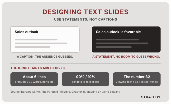
“Sales outlook” versus “Sales outlook is favorable.” Her reasoning is that the second version leaves the audience no room to assume something other than what you meant. A caption names a topic and lets every person in the room settle that question privately, in a different way. This is the Part 1 rule about slide titles, and it determines whether the deck can be forwarded to someone who missed the meeting.
The rest of the guidelines are constraints rather than principles. One idea per slide, with the only exception being an enumeration of points you will develop later. No more than about six lines or roughly thirty words. Simple words and simple numbers, illustrated with a comparison she leaves to speak for itself: “$4.9 million is easier to grasp than £4,876,987.”
Then there is a formula, which she gives under the heading “Make the type-size readable” and describes only as a dependable guideline: the number is 32. Take the distance in feet to your farthest viewer, divide by 32, and the answer is the smallest letter height in inches that person can read. A viewer sixteen feet back needs half-inch type. Lettering three-quarters of an inch high stops working past twenty-four feet. The rule is fussy and the failure it prevents is quiet, because nobody in the back row announces that they have stopped reading.
The chapter also contains a disagreement Minto prints against herself. Minto says it is acceptable to show a deliberately illegible slide if your point is that the situation is complex, as long as you admit it so the audience doesn’t strain to read it. Zelazny is quoted rejecting this:
I’m not comfortable admitting to the audience that the slide is not legible and that they shouldn’t attempt to read it; that’s a cop-out. If it’s important enough to put on the screen, then it’s important to have it be legible… Give me the charter to make it legible, and I’ll succeed 98% of the time. For the other 2%, you shouldn’t be using the visual.
Minto prints the objection rather than dropping the point, which tells you something about how the book was assembled.
Her chapter gives exhibits five pages and five question-types they can answer, then reduces the whole thing to a sequence. Work out what question the chart is answering. Put the answer in the title. Choose the chart form last, once you know what it has to show. That is the same move as the statement-not-caption rule, applied to a graphic, and it is the discipline behind thinking before you chart.
The Script Gets Written Before Anything Is Designed
Minto’s process for getting from a finished pyramid to a presentation is six steps, and the ordering is the point.
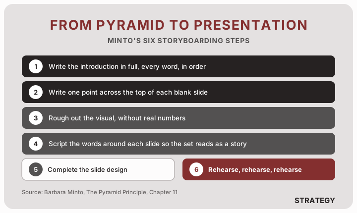
Step one is writing the introduction out in full, every word in the order you will say it. She gives two reasons for it. The first is that nothing goes missing from the opening story. The second matters more: putting it in writing is what forces you to confirm the question you are answering “is really valid for the audience.” That is the problem definition test from Part 3 running one last time, before anyone spends money on design.
Only then do you take a blank storyboard, write one point across the top of each slide, and rough out the visual without real numbers. Design happens at step five, after the script exists. Running it backwards, opening a template first and looking for content to fill it, is how you end up with a deck where each slide is defensible and the sequence argues nothing.
Step six is “Rehearse, rehearse, rehearse!” and she gives it its own line.
She closes the chapter by handing the subject off to someone else, recommending Antony Jay’s 1970 book Effective Presentation for the parts she has not covered. She quotes her favorite line from it, which is a better argument for preparing properly than anything in her own chapter:
A presentation is usually a favour bestowed by those who attend on those who present.
Minto’s Last Chapter Is About Sentences, Not Structure
Chapter 12 is the shortest in the book and the least like the rest of it. Having spent two hundred pages on how to arrange ideas, Minto turns to the problem of writing them down, and her verdict on most business prose fits in one sentence: “Good ideas ought not to be dressed up in bad prose.”
Personally, as a writer myself, I think this is one of the most underrated points in creating modern knowledge work. Given that people are at computers and spend time in things like email clients and PowerPoint, people just don’t spent that much time on writing.
She prints three real passages of business writing as evidence. This is one of them:
Current needs for accurate cash flow analyses are particularly demanding upon the existing system; it is not prepared to meet the stringent accuracy requirements. Improvements are available through incorporating information not adequately considered in making projections.
Her observation about who wrote things like this is the part that stings. These passages “were produced by bright, articulate people with excellent problem-solving skills,” and her next sentence is the one that does the damage: “Any one of them can explain his ideas orally and be completely comprehensible.” Something happens between saying it and writing it down. Her theory is that “they appear to believe that, in writing, the more dehydrated the style and the more technical the jargon, the more respect it will command.”
Her fix rests on a claim about how thinking works, which she states outright: “I believe we do all our conceptual thinking in images rather than in words.” The argument for it is a capacity limit. Nobody can hold more than seven or eight things in mind at once, so an image that packs a large number of facts into one abstract shape is what makes it possible to reason about anything complicated. Without that compression, she says, you would be deciding on the basis of a handful of low-level facts. If that is true, then bad prose is what happens when someone skips the image and writes from the abstraction directly.
To compose clear sentences, then, you must begin by “seeing” what you are talking about. Once you have the image, you simply copy it into words.
She demonstrates it in reverse, by having you read a paragraph of Thoreau describing walking down to Walden Pond with a borrowed axe, and then asking what happened in your head while you read. A picture assembled itself piece by piece: a gray day, a man with an axe, then trees, then a hillside, then the pond. She credits the term to the psychologist George Miller, who calls it a memory image. Her point is that the reader rebuilt the writer’s picture out of the words, and that this reconstruction is what reading actually consists of. Prose written straight from an abstraction skips the picture, which leaves the reader with nothing to rebuild and, she thinks, nothing to remember either.
My Takeaway
The four parts of this book get talked about as one skill, and they are closer to four separate ones. Logic in writing is a structure. Logic in thinking is a test you run against that structure. Logic in problem solving is where the content comes from. Logic in presentation is the part that assumes all three are already done and asks what happens when a correct argument meets someone skimming it in a bad chair.
Two ideas from this section are small enough to use this week. The 90/10 ratio, because counting your own slides against it takes a minute and the answer is usually uncomfortable. And the statement-not-caption rule, because captions only work while you are standing next to them.
If you want to practice these skills in a structured way, Think Like a Strategy Consultant covers storyboarding, slide titles, and building an argument that survives being skimmed.