
Think Before You Chart: Why McKinsey Bans Pie Charts
Most people build charts backwards.
They have data. They drop it into Excel. They pick whatever chart type looks interesting. Then they write a title that describes what the chart shows.
The result is slides full of correct information that communicate nothing.
At McKinsey, I learned a different habit: figure out the message first, then build the chart to prove it. Sounds obvious. Almost nobody does it.
The only chart guide you need
Gene Zelazny spent several decades at McKinsey and wrote Say It With Charts — probably the most practical book on data visualization ever written. Worth reading if you spend serious time in data-heavy work. The core takeaway fits in a paragraph.
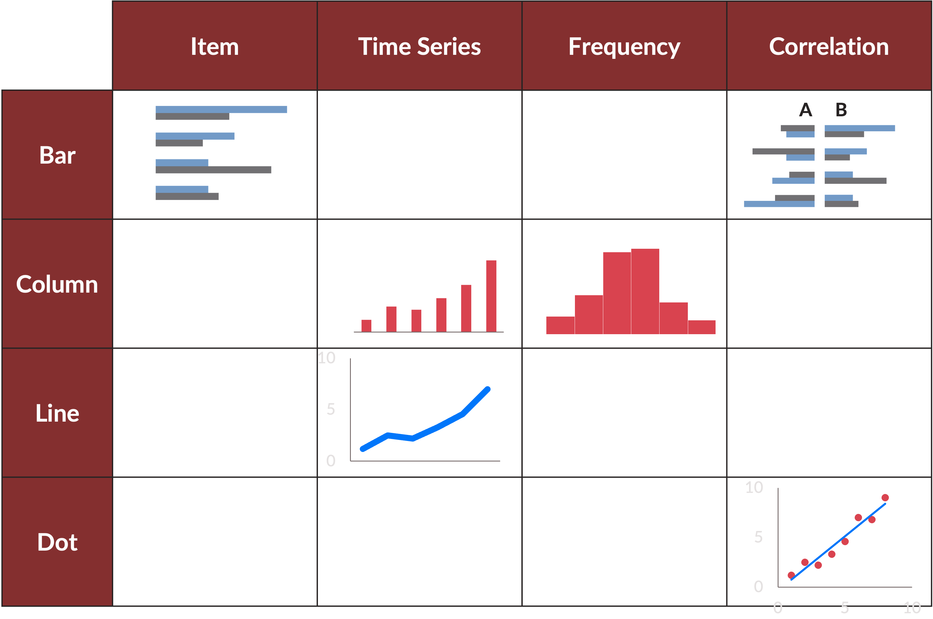
There are three basic chart types. Bar charts, column charts, and line charts. These cover 80 to 90 percent of everything you need to show. Default to them. Avoid the temptation of waterfall charts, Mekko charts, bubble charts, and everything else that shows up in PowerPoint’s chart menu. Fancy charts signal effort. Simple charts communicate.

Before you pick a chart type, answer one question: what am I trying to show?
- Comparing items at a point in time? Bar or column chart.
- Showing change over time? Line chart or column chart.
- Showing frequency or distribution? Column chart.
- Showing correlation between two variables? Dot chart. This is the one exception where you reach for something less common.
That’s it. Four questions, three chart types. Most business data fits into one of these boxes. If you want the full matrix — every comparison type mapped to every chart type — Zelazny lays it out clearly.
Why McKinsey banned pie charts
A pie chart shows you proportions, but the human eye is bad at comparing areas and angles. When you look at a pie with five slices, you can tell which one is biggest. You cannot easily tell whether the second-largest slice is 24 percent or 28 percent. So you go back and forth between the slice and the legend, and the legend and the slice, and by the end you’ve done a lot of work for very little insight.
A column chart shows you the same data with none of that friction. The bars are side by side. The differences are obvious. You can see not just the ranking but the scale: how far behind second place is from first.
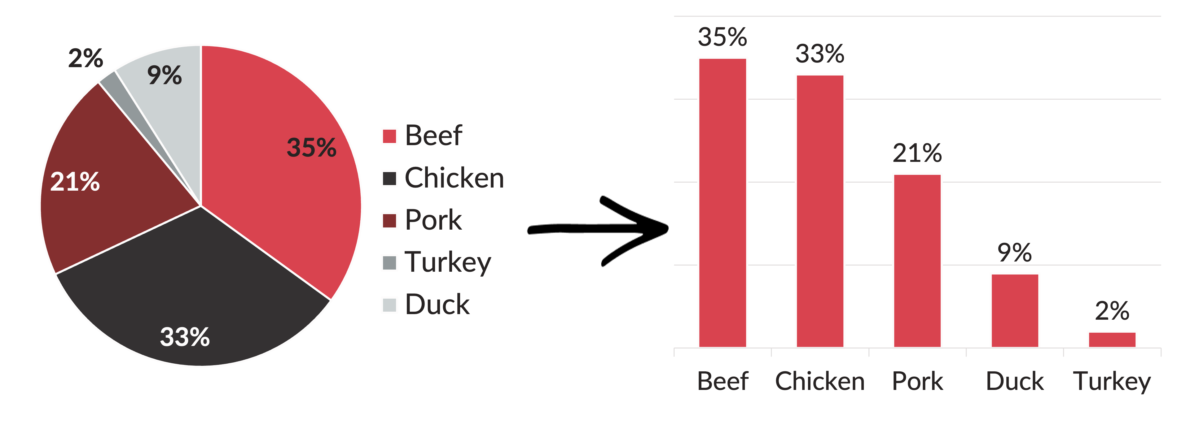
The one situation where a pie chart is defensible: when something owns more than 50 percent of the total and you want to make that visual. Half a pie is half a pie. That’s unambiguous. But even then, a column chart usually works better. The column shows the same dominance while also showing scale relative to the other items.
When in doubt, use a column chart.
What most people miss
The same data can tell four completely different stories depending on how you arrange it.
Take regional sales data for two companies. Exact same numbers. Watch what changes when you change the chart.
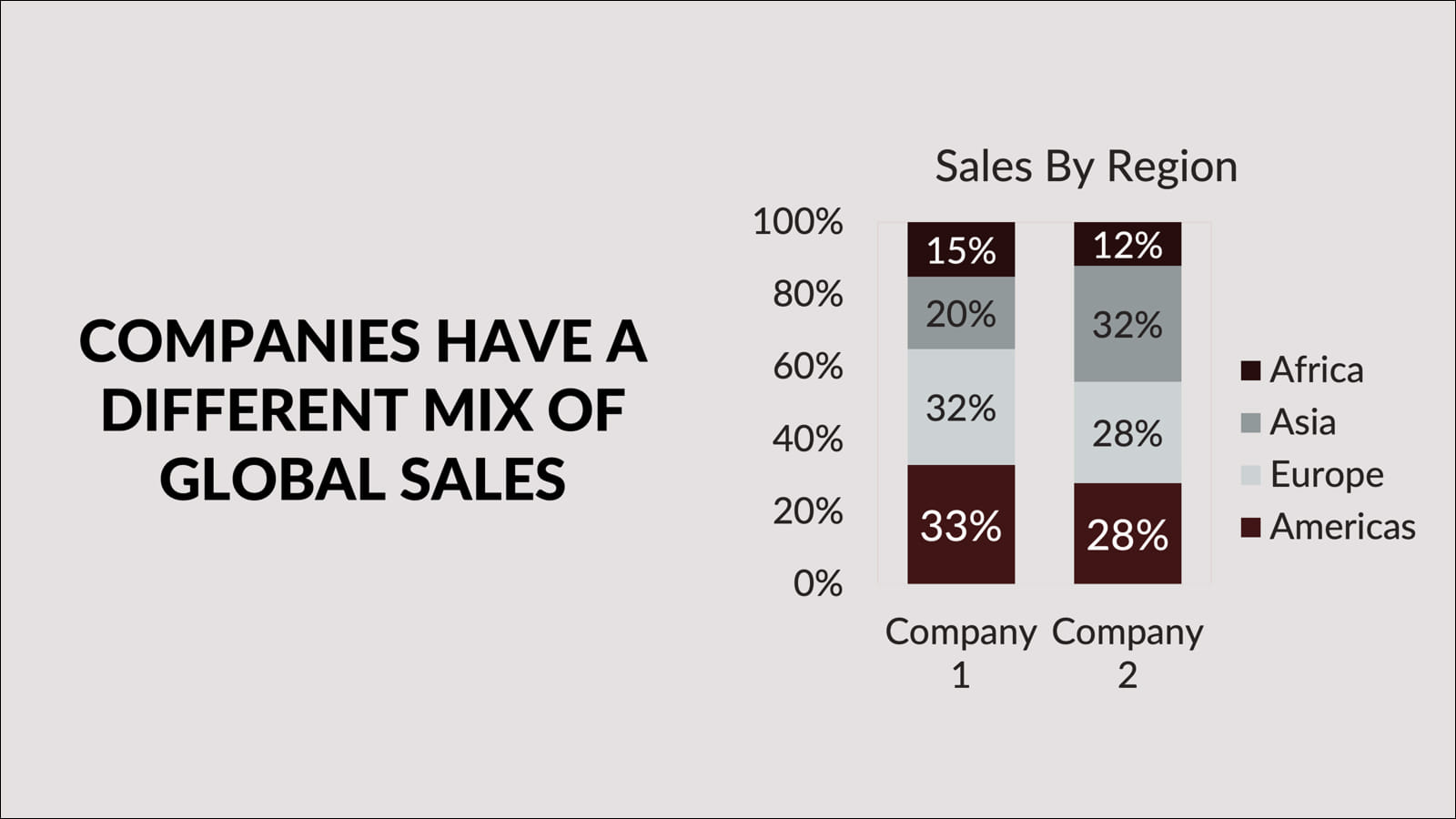
Stacked bars with companies on the x-axis. The title writes itself: companies have a different mix of global sales. You’re comparing portfolios.
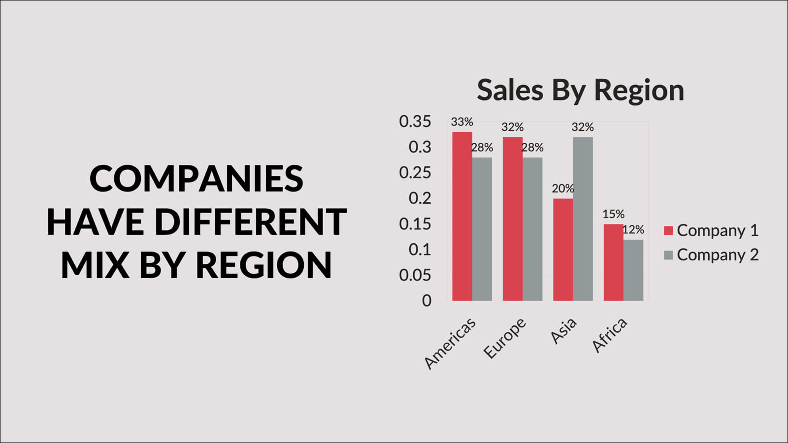
Flip to regions on the x-axis and the takeaway shifts: companies have a different mix by region. Same data, different lens.
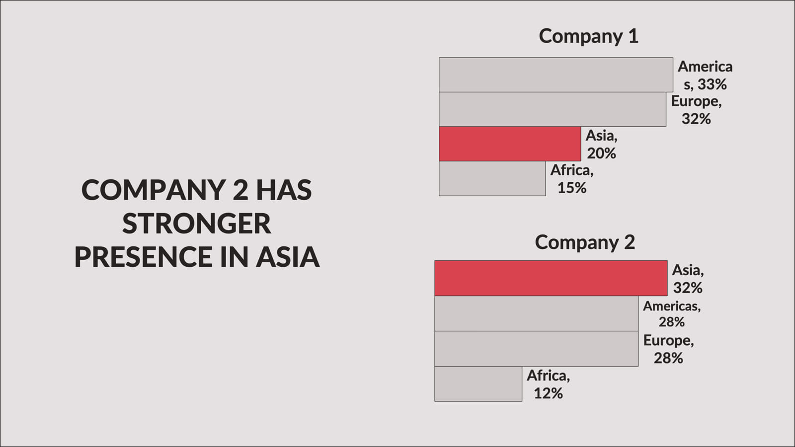
Highlight one finding and the chart stops describing and starts arguing: Company 2 has a stronger presence in Asia.
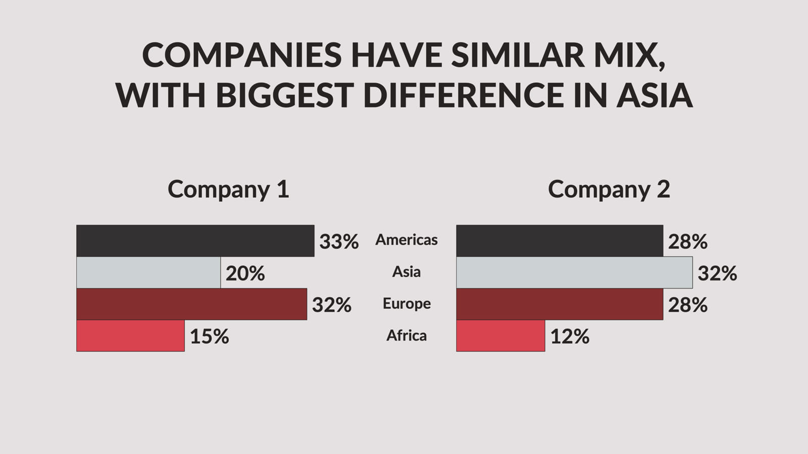
Put the regions in the center with companies on either side and you get a different comparison entirely: similar overall, but the Asia gap is the story.
Not one of those charts is wrong. They’re all accurate. But only one of them matches the point you’re trying to make. If you don’t know which point that is before you open Excel, you’ll pick one at random and wonder why your slide doesn’t land.
Think before you chart
Don’t transfer data from one tool to another without processing it. The processing step for charts is one question: what is the one thing I want someone to understand when they look at this?
Write that sentence down before you build the chart. It becomes the title of the slide. The chart’s only job is to prove the title.
Here are questions to ask yourself before finalizing any chart:
- Does the chart title match what the chart actually shows? This sounds basic. It fails constantly. If the title says “Revenue grew 40% last year” but the chart shows three years of mixed results, the chart isn’t proving the title. It’s contradicting it.
- Is the most important number the most visually prominent? Use color, contrast, or callouts to make the key data point impossible to miss. Everything else should recede. If the whole chart is the same color, the eye has no idea where to land.
- Cut anything that doesn’t support the title. Every element that doesn’t prove the point is noise that makes the point harder to see. If you can’t cut it, put it in the appendix.
- Could a simpler chart type work? If you’re using a stacked bar chart, ask whether a simple bar chart says the same thing more cleanly. If you’re using a line chart with six lines, ask whether two or three lines would tell the story. Complexity is usually a sign that the message isn’t clear yet.
One more thing about pie charts
I keep coming back to them because the resistance to giving them up is real. People like pie charts. They feel intuitive. They look like data.
But go find the last presentation you sat through that had a pie chart. Try to remember what the specific percentages were. You probably can’t. Now try to remember the last bar chart where one bar was dramatically taller than the others. You probably can.
Charts are not decoration. They’re evidence. The right chart makes evidence impossible to ignore. The wrong chart buries it.
McKinsey figured this out decades ago. The ban on pie charts was never about aesthetics. It was about communication. Every time someone has to work to understand a chart, they’re spending mental energy that should go toward your recommendation.
Gene Zelazny’s Say It With Charts (McGraw-Hill) is worth reading in full if data visualization is core to your work.